App Redesign
Redesigning the Miko Companion App to create an intuitive and engaging experience for both parents and kids, offering insightful learning analytics and a rich content hub
CLIENT
Miko
CLIENT
Miko
CLIENT
Miko
Role
Design
Role
Design
Role
Design
Service
UI/UX Design
Service
UI/UX Design
Service
UI/UX Design

Problem
Problem
Problem
Current Problems
Fragmented Experience: Previously, Miko had two separate apps for parents and kids, creating a disjointed user experience.
Limited Accessibility: The app was only available on mobile, restricting usability for tablet users
No clear visual hierarchy: Important content wasn’t prioritized properly.
Cluttered Kids’ UI: The Kids Zone had a busy layout with mixed navigation and excessive colors, making it confusing for young users.
Unintuitive Parent Navigation: Important features in the parent app were difficult to access, with key controls buried in menus.
Parent app felt outdated: Top and bottom navigation didn’t align with modern UI patterns.
Business Goals
Unify the experience by combining the parent and child apps into a single, cohesive platform. | Improve parental controls by providing easy access to child insights, learning data & settings |
Streamline navigation with a structured, intuitive layout and optimized menus for clarity and efficiency | Ensure a visually engaging and inclusive experience that caters to both parents and children |
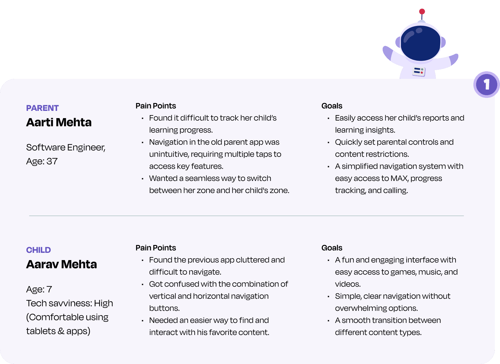
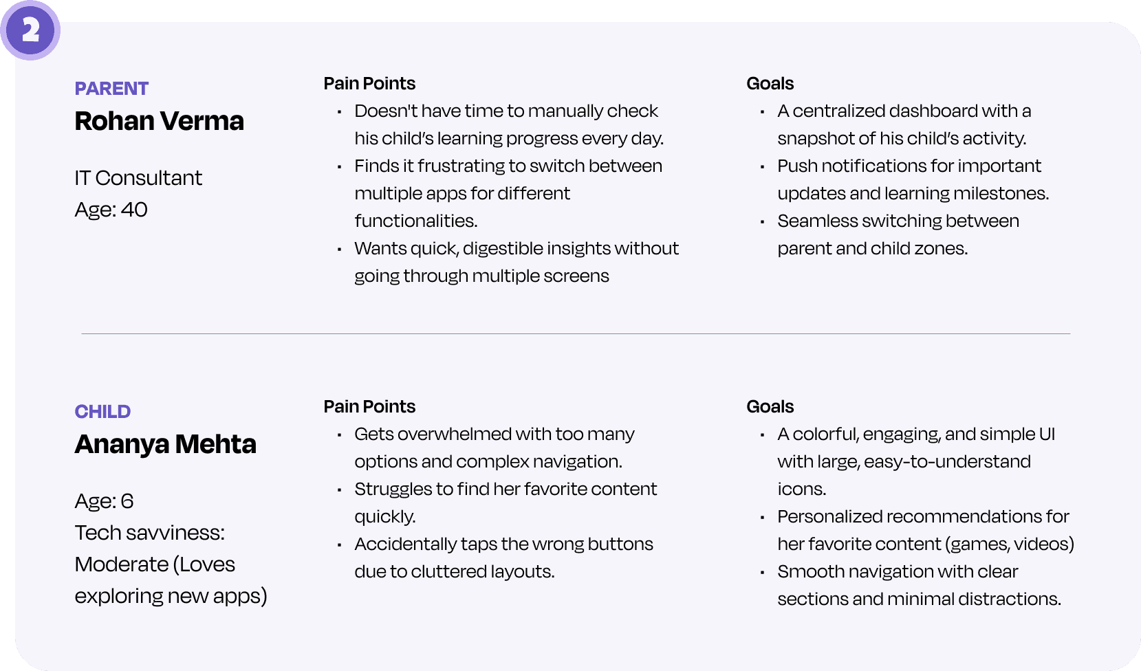
Interview Takeaways
Competitor Analysis
Key Features | Strengths | Weakness | |
|---|---|---|---|
Lingo Kids |
|
|
|
Khan Academy |
|
|
|
Current Problems
Fragmented Experience: Previously, Miko had two separate apps for parents and kids, creating a disjointed user experience.
Limited Accessibility: The app was only available on mobile, restricting usability for tablet users
No clear visual hierarchy: Important content wasn’t prioritized properly.
Cluttered Kids’ UI: The Kids Zone had a busy layout with mixed navigation and excessive colors, making it confusing for young users.
Unintuitive Parent Navigation: Important features in the parent app were difficult to access, with key controls buried in menus.
Parent app felt outdated: Top and bottom navigation didn’t align with modern UI patterns.
Business Goals
Unify the experience by combining the parent and child apps into a single, cohesive platform. | Improve parental controls by providing easy access to child insights, learning data & settings |
Streamline navigation with a structured, intuitive layout and optimized menus for clarity and efficiency | Ensure a visually engaging and inclusive experience that caters to both parents and children |
Interview Takeaways
Competitor Analysis
Key Features | Strengths | Weakness | |
|---|---|---|---|
Lingo Kids |
|
|
|
Khan Academy |
|
|
|
Solution
Solution
Solution
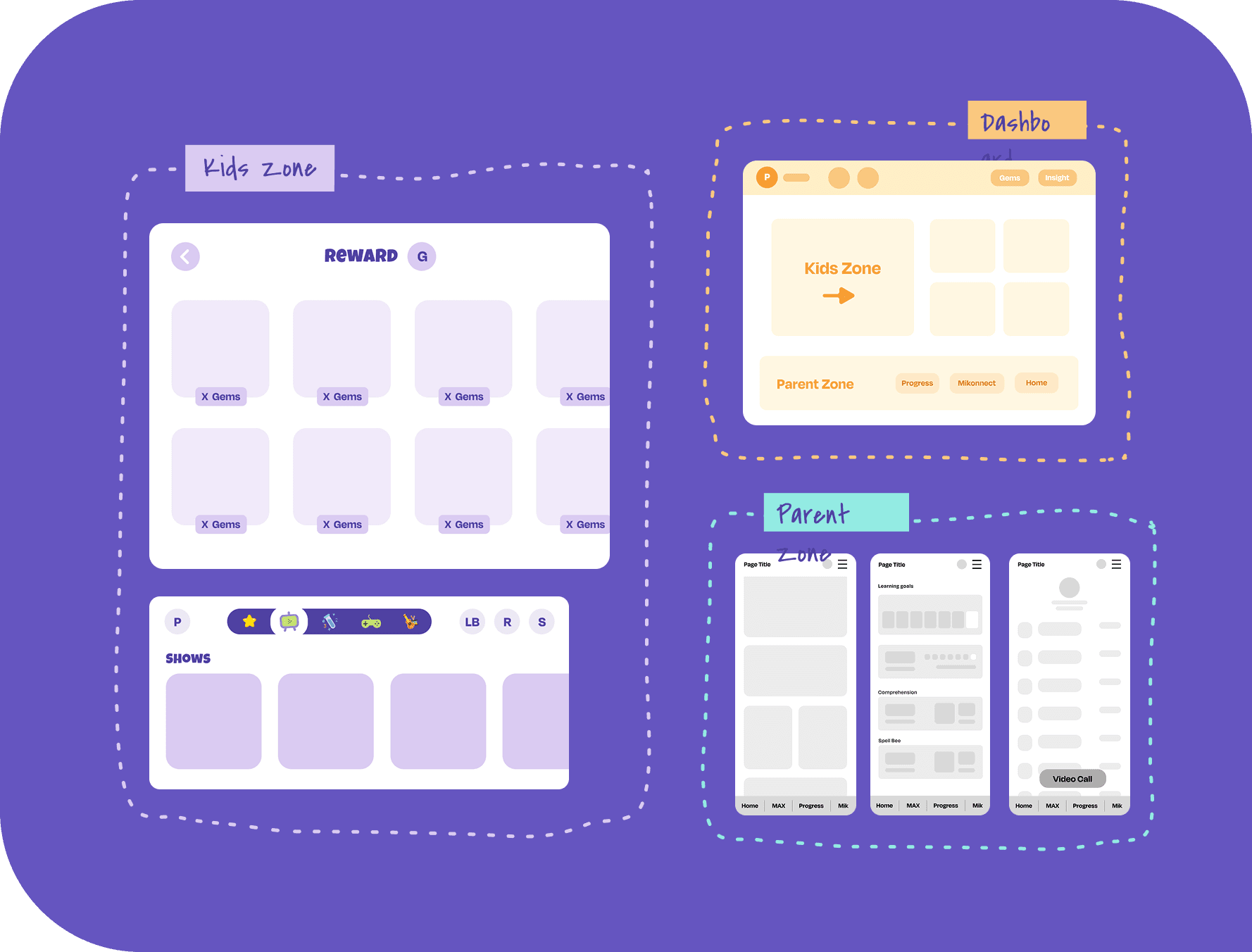
Userflow
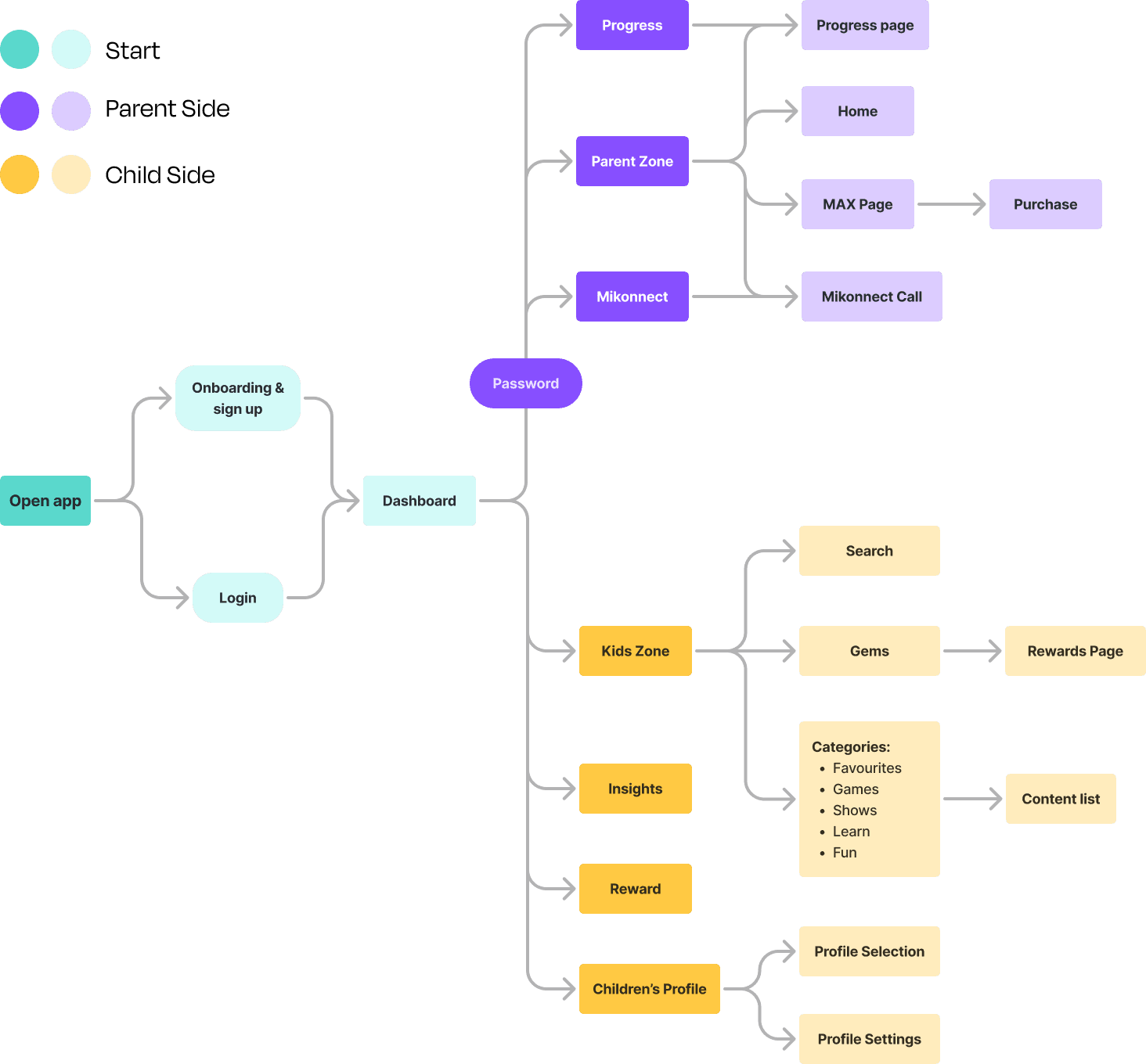
Main Screen Wireframes
Kids’ Side Wireframes:
Intuitive layouts with vibrant colors, large tappable buttons, and playful animations.
Gamified interface with progress bars, badges, and pop-ups for rewards.
Parents’ Side Wireframes:
Clean, minimalistic design with a focus on functionality and ease of use.
Sections clearly divided into tabs for quick access to controls and settings
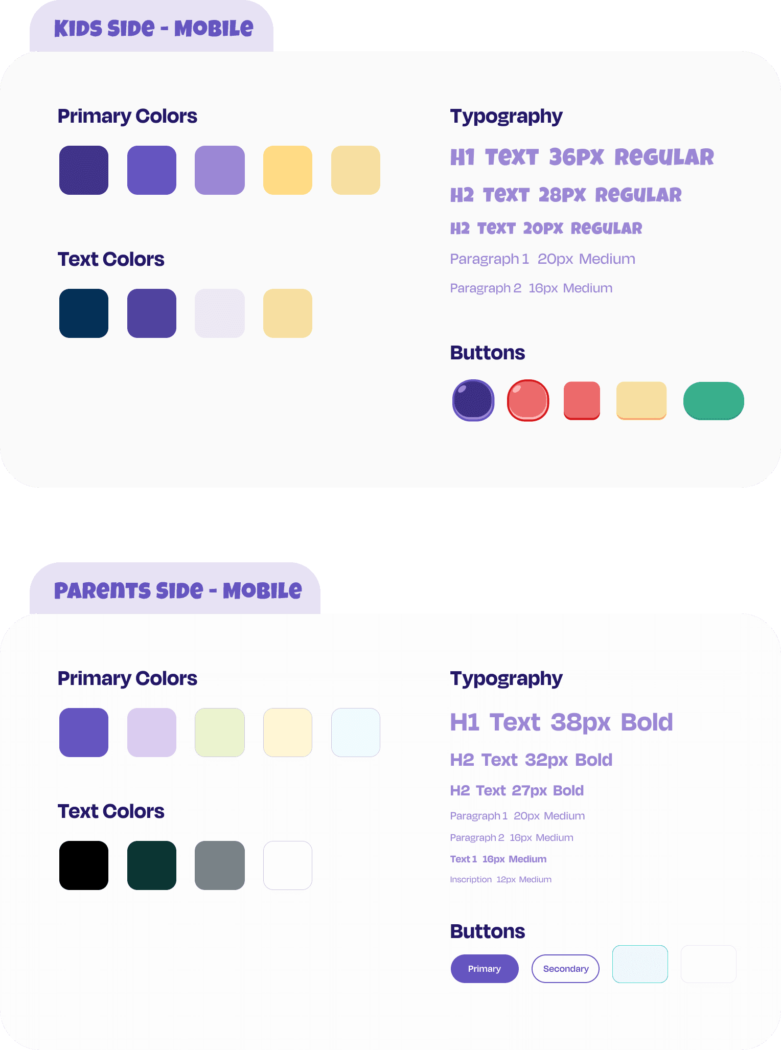
Design Language
Kids’ Side: Bright and cheerful colors like yellow, blue, and pink.
Parents’ Side: Neutral and calming tones like gray, navy, and white
Fun, rounded fonts for kids’ side.
Clean, sans-serif fonts for parents’ side.
Playful, kid-friendly icons for dancing, music, etc.
Clear and professional icons for parental controls and safety.
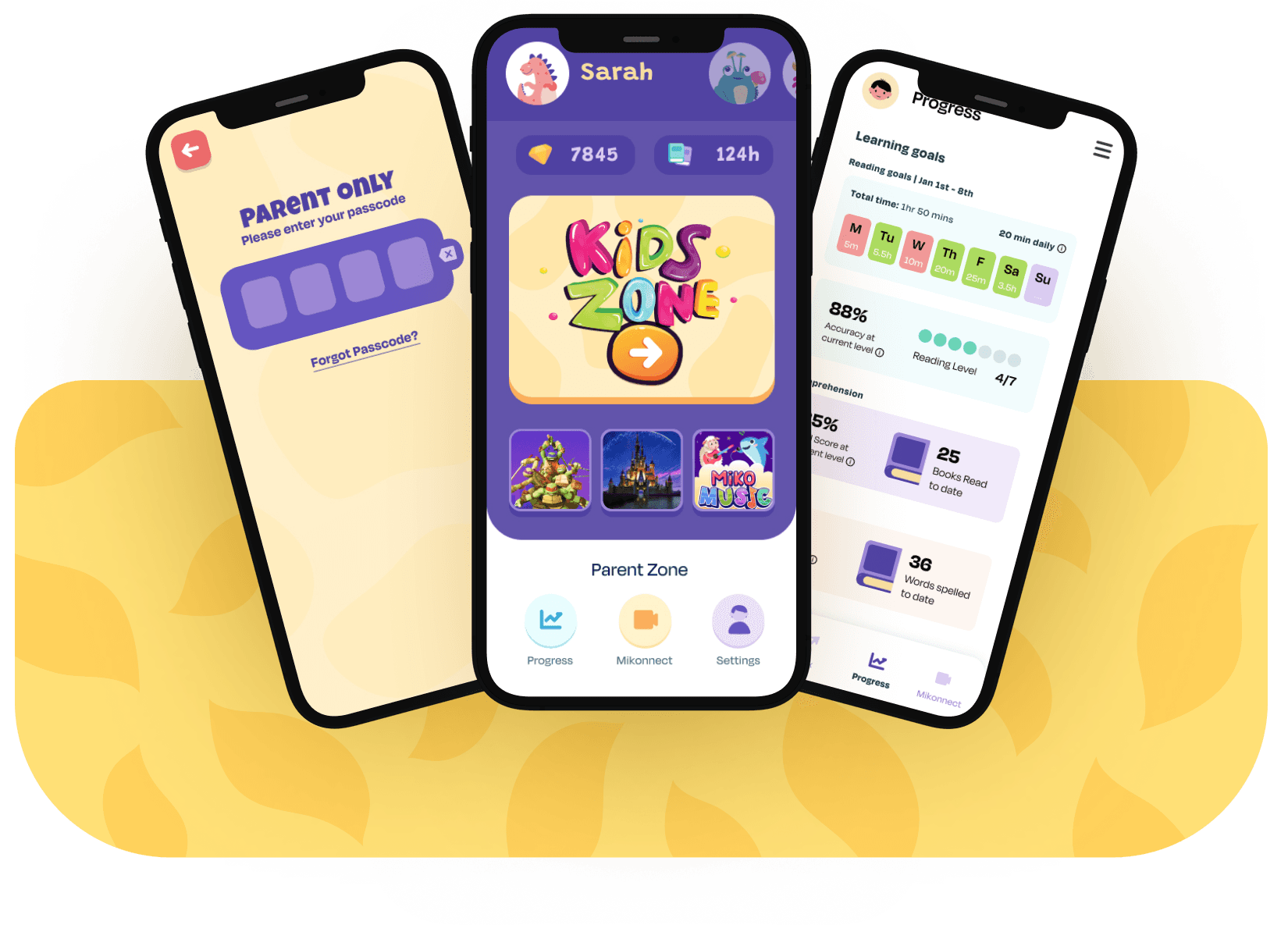
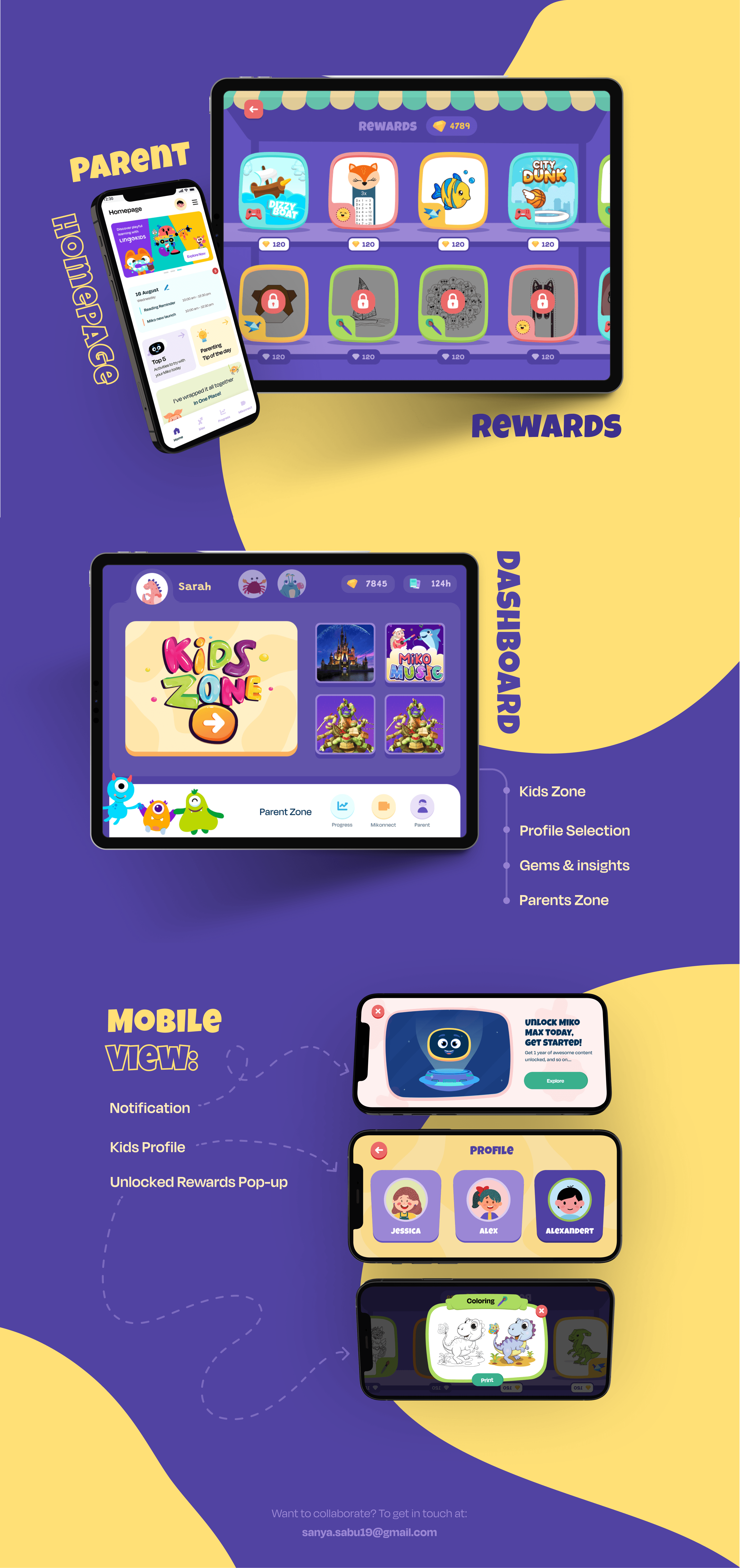
Final Screens
The Companion App bridges the gap between fun and functionality, providing a safe and engaging digital space for kids while empowering parents with comprehensive controls
The design is fully responsive for both mobile and tablet devices, ensuring a seamless experience across screens. It also includes accessibility features such as a high-contrast mode for better visibility, voice guidance to support younger users and parents with disabilities, and adjustable text sizes to suit individual reading preferences
Userflow
Main Screen Wireframes
Kids’ Side Wireframes:
Intuitive layouts with vibrant colors, large tappable buttons, and playful animations.
Gamified interface with progress bars, badges, and pop-ups for rewards.
Parents’ Side Wireframes:
Clean, minimalistic design with a focus on functionality and ease of use.
Sections clearly divided into tabs for quick access to controls and settings
Design Language
Kids’ Side: Bright and cheerful colors like yellow, blue, and pink.
Parents’ Side: Neutral and calming tones like gray, navy, and white
Fun, rounded fonts for kids’ side.
Clean, sans-serif fonts for parents’ side.
Playful, kid-friendly icons for dancing, music, etc.
Clear and professional icons for parental controls and safety.
Final Screens
The Companion App bridges the gap between fun and functionality, providing a safe and engaging digital space for kids while empowering parents with comprehensive controls
The design is fully responsive for both mobile and tablet devices, ensuring a seamless experience across screens. It also includes accessibility features such as a high-contrast mode for better visibility, voice guidance to support younger users and parents with disabilities, and adjustable text sizes to suit individual reading preferences
